


Share your project details
with us and receive a free
consultation.
So the question is: how much can we achieve only with styles change?
Let’s face it. Everyone knows how to build ideally right design-development process in theory. But the real cases often appear very distant from ones you’ve learned with your mentors. So being able to do your best even in case of limited time and resources is crucial for a development team. Thus, we are going to share our experience of dealing with such kind of tasks.
Nowadays a lot of business owners and accountants use Excel spreadsheets for solving their tasks. And very often they face the inefficiency of spreadsheets for summarizing all data related to project. It can be scattered in dozens of files which can be edited by different people at the same time. Google Docs can partially solve this issue, but still it does not deliver users from wasting tons of time on formatting tables and charts and make them fit specific needs.

Need to save your budget on your product development?
Cut overhead costs and decrease tax expenses by up to 60% with a dedicated development team in Eastern Europe
Contact Us
Before — After
Design system
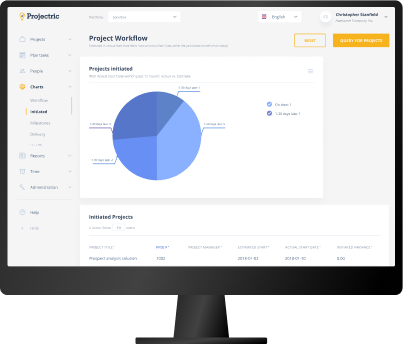
Projectric system was built several years ago basing on the technologies that were in use at that time. So the system seems quite like a naked engine. It works reliably and infallible, but it does not look nice and modern. Hence, we have got a request to make the first steps to improve system look without influencing on its structure. We clearly understand that it is not enough to make the system meet all the modern standards of CRM usability, though the key reason for that is impossibility to change both styles and user flow at the same time. We plan to make changes step by step. Bearing in mind that the Projectric system is currently in use by a lot of customers (who are mostly not very familiar with the latest IT-technologies) we decided to change it gradually in order to give users time to accustom the changes.
As we can see, the old interface has plenty of visual issues that make the content quite difficult to perceive. Among them are cumbersome main navigation, absence of visual hierarchy and accents, lack of free space, too tiny font size and too dark colors. Also it is not obvious that some UI elements are clickable. Thus, fixing these issues could be a quite good start towards clear and easy perceptible look.
01
If we need to change all the styles in the huge system it is smart to develop a guidelines which include measures and rules for each element. It allows to simplify the implementation and development new pages in future even without designer assistance. Also design system is crucial for components uniformity and consistency.
02
Actually, using only css changes we can make a lot. Everyone knows that if styles are disabled even the coolest web applications look like basic text and tables. So putting styles in order due to the main visual design principles could be a really great start.
03
To provide the client a full understanding of the new layout we provided an interactive prototype filled with real data. So it was easier to imagine how the refreshed system will behave in real life. We tried to create as detailed prototype as possible for time-quality prospective.
04
Working on this project we proved to the client that he can get a sufficient result even after very basic but right changes. As for the further steps, we plan to investigate how users will interact with this new refreshed look and due to that we will suggest changes that will make UX more convenient.
Related cases

Balance Wheel
Ionic Framework
AngularJS
Balance Wheel Pro is an effective self-coaching tool for assessing and improving the life balance. It allows to build various balance wheels, evaluate personal performance in any field, set goals and track progress.

NRM
Cross-platform
React Native
Social
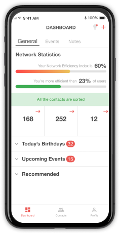
DOIT Software team developed a proactive network relationship management solution that helps users to analyze their contacts and organize them into specific areas of interest. The system provides sophisticated network efficiency index measurement, using suggested and initiated suitable engagement patterns to predict the most efficient activities. Also, it allows transcribing voice-to-text automatically.
Categorize, group and analyze contacts, see upcoming events.
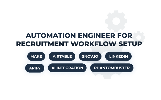
Automation Engineer for Recruitment Workflow
Make.com
Phantombuster
Apify
Airtable
AI
Automation
The US recruitment agency approached DOIT Software to augment their team with an automation engineer. They needed an expert to transform their manual sourcing process into an AI-powered workflow.
Within 2 weeks, DOIT placed a Make.com developer experienced in the recruitment workflows setup. As a result, the specialist built an automation that cut candidate delivery time from 3 to 1 week. Now, the client can analyze 3x more CVs without expanding headcount.
Contact us